Blue Roof Labs
  • Home
  • Air and Space
    • E-PREP
    • Mission Planning
    • Agricultural Drones
  • Manufacturing and Supply Chain
    • Microelectronics
    • Virtual Factory
    • Supply Chain Risk Analysis
    • Installation Resistance
  • Health and Wellness
    • PRISM Diabetes
    • COVID-19
  • Archive
    • Dew Line
  • Contact
Text reads: PRISM Diabetes
What if people with diabetes had a comprehensive tool that provides personalized analytics, education, and tools to improve communication with their care teams?
Flowchart of PRISM process. Published best practices, physician experience, and individual CGM data go into PRISM, and PRISM creates a personalized treatment program from the data.
Diabetes is one of the fastest-growing diseases of our time.  There are 425 million people trying to avoid blindness, amputation, and organ failure.  They will spend nearly $1B this year doing so.  By 2045, there will be 629 million people in the same situation.  By then they will be spending over $5.5T per year.

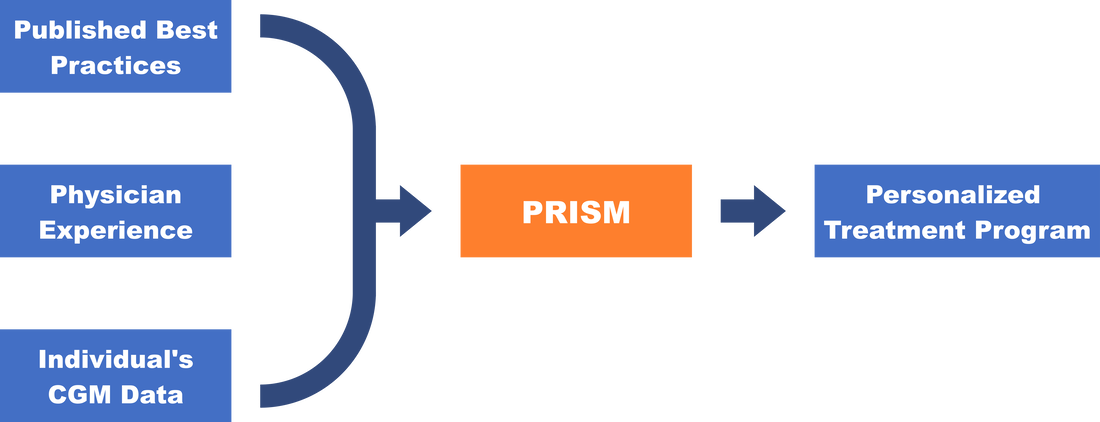
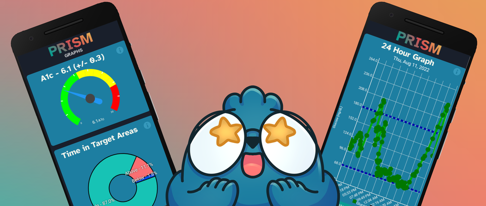
None of this suffering has to happen.  Our analytics can turn this around.  Enter PRISM - Blue Roof Labs' solution combining an individual's unique Continuous Glucose Monitor (CGM) data, published best practices, and physician experience with our proprietary artificial intelligence and machine learning capabilities.  Initial testing of PRISM combined with an appropriate regimen of diet, exercise, and medication adjustments lowered A1c from 12.9 to 5.8 in 18 months and increased time in target glucose range to 96% - with no increase in basal insulin and no bolus insulin at all.
Blue banner with text that reads: Personalized Analytics
Continuous glucose monitors (CGMs) collect over 30,000 data points per year. Each data point is integral to learning the whole story behind a person with diabetes' health. This data can become incredibly overwhelming. PRISM works to analyze this data and display it in a way that is user-friendly, straightforward, and that empowers users to take control of their health. 
​
PRISM uses artificial intelligence to automatically create personalized data analyses from CGM data. User data never leaves the user’s phone without prior authorization, as the analytics are all done locally.
​
Picture of Bobby the blue blob with two phones beside them. One phone features the PRISM app on the A1c graph screen, and the other features the PRISM app on the 24 hour graph screen.
The analyzed data is then shown visually through a variety of graphs. The graphs include the following:
  • A1c Gauge: The user’s estimated A1c using CGM data. This is accurate to +/- 0.3.
  • Time in Target Areas: The percentage of time that the user was above, in, or below their ideal blood sugar range.
  • Complete Slope: The percentage of time that the user’s blood sugar level was rising, falling, and constant in the last 90 days.
  • Sleep Slope: The percentage of time that the user’s blood sugar level was rising, falling, and constant at night in the last 90 days.
  • Peaks: The number of the user’s blood sugar level peaks in specific time buckets in the last 90 days.
  • Troughs: The number of the user’s blood sugar level troughs in specific time buckets in the last 90 days.
  • Overshoots: The number of the user’s blood sugar level overshoots in specific time buckets in the last 90 days.
  • Undershoots: The number of the user’s blood sugar level undershoots in specific time buckets in the last 90 days.
  • 90-Day: The user’s blood sugar level recorded by their CGM throughout the last 90 days. 
  • 24-Hour: The user’s blood sugar level recorded by their CGM throughout the last 24 hours.
Blue banner with text that reads: Educational Modules
PRISM utilizes engaging education modules to bridge the gap between CGM data and action. PRISM has text, video, and podcast versions of each educational module in order to accommodate each user’s learning needs. 

The educational modules were developed using a variety of trusted diabetes health resources. All resources are available in the app and on the PRISM website here. The modules function as a step from data to action, giving the users some information to talk to their care teams about and places to look for the latest in diabetes health information. 

The modules cover topics including:
  • Squish Then Scoot: Reducing the range of and lowering your blood sugar.
  • Asymmetric Penalties: Defining the differences between hyper and hypoglycemia.
  • Sleep Impact: Highlighting the effects of sleep on blood sugar.
  • Importance of A1c: Analyzing the importance (and limitations) of A1c. 
  • Roller Coaster: Navigating the ups and downs of blood sugar.
  • Diet Tuning: Making educated decisions about food quantity, quality, and timing.
Picture of Bobby in a graduation gown standing next to three polaroid images. The first polaroid has a picture of robot Bobby smiling, the second has Bobby on a roller coaster with a bed as the car, and the last has drawings of different healthy foods.
The lessons also include a fun character that serves to tell realistic stories about instances that a person with diabetes might face. Bobby is an energetic blue blobby friend that functions as a guide and personal cheerleader for anyone using the app. Bobby knows that diabetes is exhausting, stressful, and full of roller coasters, so he is here to stand by users and support them through it all.
Blue banner with text that reads: Care Team Integration
PRISM is not built to replace care team visits, but rather it is a tool that can be used to help facilitate communication between a person with diabetes and their care team. 

A typical patient visit is only 15 minutes. A year of blood glucose data contains over 30,000 data points. 

In the short time that a care provider is meeting with a person with diabetes, they need to interpret blood glucose data and relay information to their patient. Often this leaves patients feeling as if all of their questions haven’t been answered or that they haven’t gotten enough out of each visit. PRISM’s graphs, care team communication tools, and journal abilities help patients to relay information about their health efficiently so that they can get what they need out of their appointments.
Want to learn more about PRISM? Click the button to go to our site!

We are seeking qualified external investors interested in supporting PRISM Diabetes. Get in touch with us today!
Blue button with text that reads: PRISM Diabetes
  • Home
  • Air and Space
    • E-PREP
    • Mission Planning
    • Agricultural Drones
  • Manufacturing and Supply Chain
    • Microelectronics
    • Virtual Factory
    • Supply Chain Risk Analysis
    • Installation Resistance
  • Health and Wellness
    • PRISM Diabetes
    • COVID-19
  • Archive
    • Dew Line
  • Contact